


Initially looking at some geometric typefaces that I know and love, then taking elements from these into my own designs.


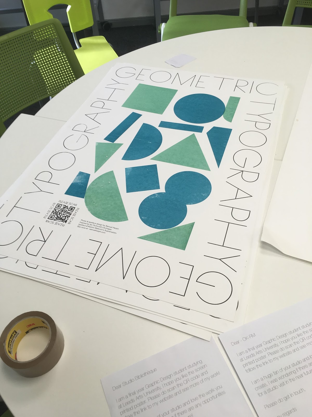
I wanted the designs to be simplistic yet referring back to geometric typefaces of old like Futura and Avant Garde. The designs were based on the thin stroke initially then expanded into thicker weights. The posters content was aimed to be simple and place the focus on the type itself.

I decided on a rectangular layout for the type, based on some research into contemporary poster design.


These posters above showcase really exciting graphic design but the communication takes a back foot and the design becomes the focus this is what I wanted to achieve in my own designs.
Based on the rectangular layout of type there needed to be some content in the middle of this. I began looking at artists that really inspired me and could reference in this space.


The work of Franz Marc & Kazmir Malevich both utilised geometric and colourful shapes that represent more figurative imagery. These designs really inspired the further developments in the posters design. Taking inspiration from modern art is something that give a more varied outcome that isn't just based on graphic design aesthetics.


These two coloured designs were experimented with trying to utilise the space in the middle of the designs. The left hand design was subsequently taken forward for the final screen print.

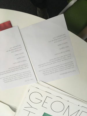
As these posters would be sent out to studios using a QR code allowed the viewer to scan the code and then get taken to my portfolio/website so they could see more of my work. These would be followed up by emails to ensure the easiest communication possible.


The finished outcomes were a high standard, and made for the perfect example to send out to studios and try and get studio visits and internships in the future.
The quality of the screen print needed to be high to demonstrate my own qualities as a designer.
No comments:
Post a Comment