
First what not to do! - printing out mock up with the long edge binding rather than short. This is an example of why printing mock-ups are important, it is only through trying it out that you realise mistakes. I feel confident on my skills on printing in In Design, paying close attention in the computer resource workshops is a result of this.


A smaller size has been looked at but the content is much more readable on a large scale.
At this stage, it was useful to print a scale black and white mock up, so it could be read at real scale and iron out any details.

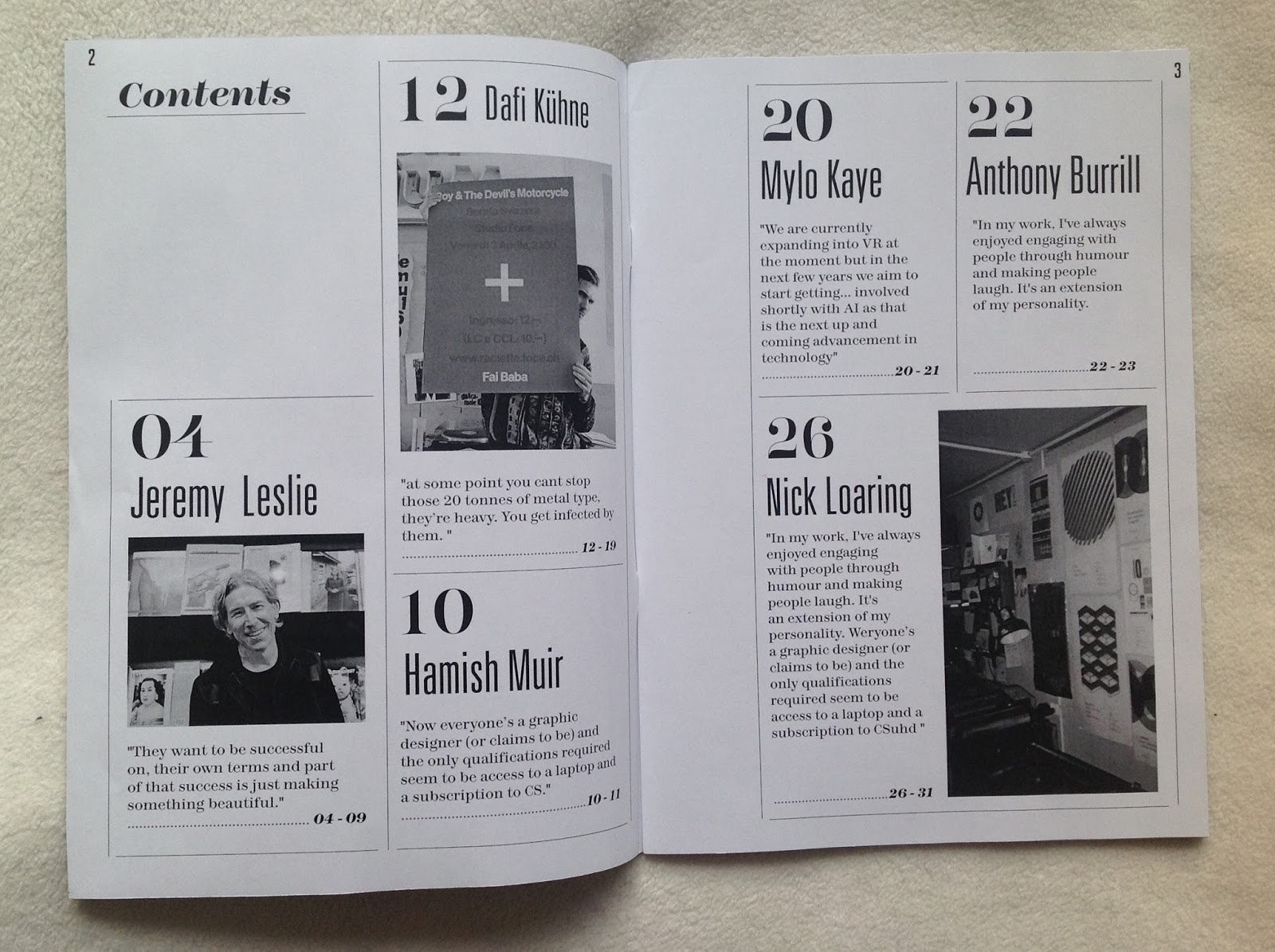


This process also showed that the designs in a way worked in black and white, and gave the publication more of a light weight and disposable feeling. This could be a possible solution went printing the finish products. The mock-up has overall been invaluable in spotting small details and looking at the overview of information.

Printing a colour cover would allow clarification of the colours selected as wells the overall quality that it would show. Cracking in the ink was a downside to this but the communication was clear and to the point.
No comments:
Post a Comment