My development within the second year has allowed me to further underline my interests in typography, editorial design, exhibition branding and work in the creative sector. This part of graphic design and design in general in my opinion allows more space for expression in its playfulness as wells manifesting in a verity of formats.
Moving forward I would like to undertake as many of these kinds of projects as possible to further push my knowledge and skills. The collaboration project of responsive has shown me that to create the best results, more skill sets create different and new ideas that really push the designs further.
The next steps for my practice are to try and build up some clients to work for and try and plan internships, as well as keep trying to push my work and develop my understand of design. Within responsive I also undertook at DA&D brief, this gave the opportunity to explore a more advertising based project, though the work produced was effective I didn't enjoy it as much, highlighting were my practice lies.
The book Studio Culture by Unit Editions gave me an insight into some design studios and how they function, from this I really feel a smaller more intermate studio would suit me, this tighter development of projects and more personal setup would suit the way I work.
Throughout the year I have been active in contacting professionals and growing in confidence as a designer. Going to the Unit Editions meets MagCulture talk allowed me to interview Jeremy Leslie, this was a real eye opener in terms of magazines and editorial design, research into the subject and more importantly an interest in magazines meant the questions prompted some really interesting answers. Though I was very nervous I enjoyed the entire process from doing the interview and designing the publication.
Sunday, May 7, 2017
Final printed & bound Publication.


The finished publication, as we plan to print the publication professionally over the summer it was really important to get a feel for what it would look like and design it to a certain level. I all for the design to be really integrated and changed around once each member of the group has their say but this I feel is a great basis to work from. Compiling all the interviews creates a much more interesting and informative piece of work, that hopefully will be taken forward and printed professionally.
The quality of the print needed to be of a high standard to best display the work and feel as professional as possible.
The simple two staples is cheap, effective and does the job. Expansion on this could be done when taken further.
This would be a fantastic way to get our names out there as designers and try to establish some recognition on the design scene. This publication could lead to many opportunities and a possible chance for a second or even a third edition. All in all it has been a real treat to try and show off some editorial skills as this is emerging as a real interest in my practice. Hopefully, it is through experimentation and development can I learn more and more about this part of design.
Mock Up Publication

First what not to do! - printing out mock up with the long edge binding rather than short. This is an example of why printing mock-ups are important, it is only through trying it out that you realise mistakes. I feel confident on my skills on printing in In Design, paying close attention in the computer resource workshops is a result of this.


A smaller size has been looked at but the content is much more readable on a large scale.
At this stage, it was useful to print a scale black and white mock up, so it could be read at real scale and iron out any details.


This process also showed that the designs in a way worked in black and white, and gave the publication more of a light weight and disposable feeling. This could be a possible solution went printing the finish products. The mock-up has overall been invaluable in spotting small details and looking at the overview of information.

Printing a colour cover would allow clarification of the colours selected as wells the overall quality that it would show. Cracking in the ink was a downside to this but the communication was clear and to the point.
Saturday, May 6, 2017
Creative Report as zine/magazine

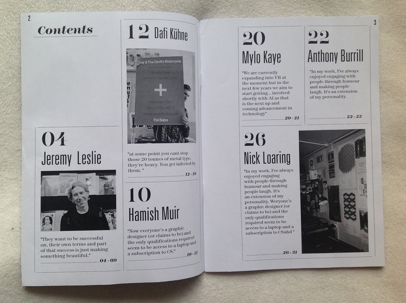
The cover has been designed to put the emphasis on the big names of the interviews. As the publication looks mainly on typography and print as its main themes, the cover design would need to be really considered and appropriate this context. The large decorative typography reflects the content.
The placement of sir names and first names on the back and front creates a consistency between the two, and highlights 'big names' as the contents artistic focus. The colours have been chosen for their high impact yet interesting subtlety between the red and pink. The white asterisk gives the cover some personality and this is continued at the end of each of the interviews featured.
The subheading gives an extra context the publication concisely but the white colouring ensures clarity. A subtle typographic feature that is the FI ligature on Dafi Kühne. This is possibly somebody with an interest in type, would spot and hopefully add an extra level of intrigue.

The use of both san serif and serif typography aims to display in contemporary and more classical styles. This combination is typical of many editorial designs.


The yellow and brown type has been informed by Apartamento's design styling, changing just the colours of the background and typography used puts the emphasis on the content quality rather than distracting from it.
Using a medium italic typeface on each of the questions keeps the information consistent and is clear throughout the publication. The bright colours make sure the section stands out and is eye-catching to the reader.

The Hamish Muir section needed to be consistent in style with the rest of the publication but also be different and reflect the interviews content. The 8vo style is famously black and white this has informed the colour scheme. The use of the NSW01 typeface designed by Matt Willey is something a different and creates an extra sense of intrigue communicating the high profile name of the designer. The black, white and grey type creates an interesting hierarchy that make the information easy to read. Overall the communication really reflects the quality of the content and is reflective of the 8vo style.


Much like the rest of the publication the Dafi Kühne section has been designed to be as clear and easy to read as possible. The black and white type and background is different to the rest of the publication, the inclusion of some of Dafi's posters break up the text and give something more to look at. Overall the communication is appropriate to the text-heavy content.

As the Mylo Kaye's content looks at slightly different themes to the rest of the publication, this needed to be reflected in the design the grey and blue colours reflect more the 'screen orientated information displayed.
Again using a Matt Willey designed typeface puts the content at the centre of the design. It was important to make sure the background was different so it was totally clear this was a new interview. The asterisk marks the end of the interview, this has been continues throughout the design.

As the Anthony Burrill interview is all about Wit in graphic design the design could be more playful and use some brighter colours, the black and white creates real contrast and is something again a little different.


This shows the front and back of the cover, highlighting the way it would be communicated, overall this cover reflects the fairly text heavy publication and the quality of the interviews inside.
Subscribe to:
Comments (Atom)