I have had the pleasure of visiting Lord Witney's studio in Leeds to find out about what they do, their creative practice and what makes them unique. They showed us some of the projects they have undertaken and their journey from university through into the creative industry.
The made the point about how they had always been unsure with what it is they wanted to and it wasn't until the last week of third year that they feel as if they found there own flavour in graphics and knew what kind of works they wanted to make.
I feel this is something that a lot of creative people including myself are very unsure about and it is great to see these designers being so successful and they expressed this uncertainty in there work as they were starting up.
Their work is mainly these surreal and abstract back drops and scenes that use really bright eye-catching colour. One thing i really loved within there design practice is how they create work that they are personally passionate about and want to create that has not been commissioned and this then leads to exposure and projects in the future. In terms of how a design practice should work this is extremely inspiring and the best way of getting you name out there and creating projects that inspire you!
They also expressed this real emphasis on being yourself and how this will always lead to the most sincere and engaging work that you will enjoy creating. They additionally stressed this idea of not being predictable in there workings and trying to surprise themselves in their work.
The also spoke about inspiration and how the best inspiration comes from the as many different places as possible.
And lastly the spoke about how it is important to not be overwhelmed looking at other designers work it may seem as if this work is far above your level but it is all smoke and mirrors and the effort and hard work is really that makes this.
I found the Lord Whitney Studio visit to be very exciting and inspiring to see a slightly different kind of design studio that is uses image and shape rather than a much more type based designs. This way of working that has a real focus on making work that they want to make rather than being client lead is really inspirational and something I would love to do in the future.
Sunday, February 28, 2016
Tuesday, February 23, 2016
Rost Graphics Berlin
Rost the art of drawing, visiting Berlin in 2013 I found this brilliant graphic illustrators work on display in the Hamburg Bahnhof gallery, the works focus being on urban landscapes created in a traditional Japanese print style.

 The work really stood out for me due to the combination of detailed intricate use of line and shape but with a subtlety and simplistity due to the use of complimentary and contrasting colour tones.
This technique of using more traditional japanese print methods but the content being much more contempary and of the time. There is a real graphic style to these illustrations and the combination of the red type in the top left along side these striking images makes for an engaging and alluring design.
This kind of graphical illustration is something I would love to try and experiment with in my workings, I have always had a passion for architecture in design and art and this work is the perfect example of how they can be combined to be interesting and engaging.
Sunday, February 21, 2016
PINTEREST!
I have found Pinterest to be a great form of inspiration and influence within my working it is brilliant for discovering new artists and designers!
KAWS
Brian Donnelly AKA KAWS at Yorkshire Sculpture Park
I have recently visited the KAWS exhibition at Yorkshire Sculpture Park and was totally inspired by his work and how he has translated his street graffiti style into a such a engaging more traditional exhibition. His work is mainly collectable toys and t-shirts but this exhibition shows a much more contemporary kind of sculpture typically seen at YSP. I particularly liked the large screen printed images that play with this abstract use of line, shape and colour. Overall the KAWS exhibition offered a refreshing change and felt as if it was something a little out of the ordinary and different!
Forget all the rules about graphic design.
Forget all the rules about graphic design.
By Bob Gill
I have found this book to be very inspiring, it is all about problem solving within graphics and the idea that a design doesn't need to be complicated or labourite but it just needs to solve the problem.
Bob Gill being one of the leading type designers over the years his insight into past project he has worked on and outlining the problem and the his solution.

This kind of straight forward thinking as a design is something I had not really come across, his philosophy is that within any creative project the solution is already there but just needs to be discovered rather than created. I beleive this to be true a lot of the time and can be used to discover the most appropriate and engaging design.
This page titled 'Think, Then Draw' I found particularly interesting as drawing is something I feel I am confident in and can create what I want quickly this idea that taking the time to think about it before can be very useful. Bob Gill seems extremely methodical within his design practice and creates a process to work with before he has even started. This is something I personally feel is slightly different to me I prefer to experiment and find the design along the way.
Music Poster Design

I have been asked a few times by friends that are setting up nights at various clubs to design the posters this I something I really enjoy doing and try to push my designs to make them as eye-catching as possible! I find even if one person says ' I like the poster, good job' that it is a success and I am proud of what I have done. These are three example of some of the most successful designs. With the designs I am allowed near total freedom and can create what ever I like this is something fairly rare in the design world! Having a good relationship with the client in this case my friend allows us to have a in-depth convocations on what he likes in the designs and other things I should highlight in more detail. This kind of design is something I want to continue with as much as possible.
Total Design

Total Design
This book shows a body of work over 20 years from the design studio 'Total Design'. There work has an very slick modern feel to it looking at the modernist principles of form over function but with much more expression within this. The use of flat colour and abstract dynamic shape is typical of the designs.

Though some of the work feels a but dated now this simple, minimalist graphic kind of design is engaging and captivating.
I found this book to be a great read and I found some examples of graphic design that I would never have if I had only looked online.
The design practice aims to look at things differently even the book itself is a extremely irregular shape! This process of looking deeper and creating designs that are less obvious and different is something I would like to try and bring to my own work. This is what gets recognised and stands out from the rest!
YSP
Yorkshire Sculpture Park Redesign
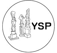
Within Studio Practice one of the tasks was to redesign the logo for Yorkshire Sculpture Park based on our experience there. This kind of design for exhibitions, museums and galleries is something I personally am interested in and love engaging with. I tried to look at some of the more well know sculptures in the permanent collection in the park and create a logo from my sketches.
With this kind of design I feel there is a opportunity to look at much more artistic and abstract approaches to the designs and this is something I really enjoy looking at and experimenting with. I feel I enjoy creating this kind of work and it doesn't feel like work but something I want to be doing.
I found this small task to be very interesting and enjoyable I would love to be able to continue this kind of art lead design in the future within the graphic design field.
Design a spread for Berkeley Homes Magazine
I have been able to help design the layout for Berkley Homes magazine article about their work in the community and looking at the artist Camille Walala and her designs.
This was a great opportunity to see how a magazine spread is put together and gain some understanding about type sizes, using professional photographers images and how this will all translate into print.
Camille Walalas work being very abstract and plays a lot with shape and line the design should reflect this using these black boarders for the large images and then using white space around the other images.
Just looking at this design being created I feel I have defiantly learnt about how magazine layout design works, and how it is put together and step by step process of doing this.
Cutie and the Boxer
This film offered a beautiful insight into how the two artists live, how they work and the complexities of there relationship!
Their care free and spontaneous attitude to all things creative is extremely refreshing and because of this they create some brilliantly abstract and powerful pieces of art!
The film explores the issues that an artist faces on a day to day basis and shows in detail how the artists go about creating work and getting there work out there.
I have found this film to be a interesting insight into a very different way of working that is much more about the process of making rather than the final result.
Charles and Ray Eames at the Barbican

Charles and Ray Eames!
Over the christmas break I visited the Eames exhibition at the barbican and was totally blown away by their work, I knew a little about their practice and mainly their furniture and architectural works but had no idea on the multitude of different works they create like sculpture, textiles and graphic design.

I found their connection to the natural and using a more humanist kind of modernism very inspiring. There was a real emphasis on all their designs wether it was architecture, furniture of even kids toys that it had to be able to be used and not be too stark and cold. This I feel was the influence of Ray on Charles she seemed to bring this more colourful and engaging side out in his work. They seem to have an amazing relationship within there working and how they collaborate together is incredible they are defiantly the dream team of design in my opinion.
I found this exhibition to be particularly inspiring as it is a kind of modernism that is not as bare and mathematical this kind of design is something I would love to show in my work practice. I also loved this ambition to be everything in the design industry the idea that is you can design one thing why cant you design anything!
This exhibition leaflet also caught my eye I loved the little map drawing showing you where to walk in the exhibition this simplicity of the drawing makes is very clear but something pretty fun!. All of the Barbicans identity and leaflet design is extremely engaging and has this underlining modernist feel to it.
Wednesday, February 17, 2016
Exhibition leaflet Design.
Exhibition leaflet and Identity design.
Within the field graphic design a area I have always been very interested and fascinated in is the branding, identity, guides and leaflet designs for galleries and exhibitions. These are just a few examples of some beautiful designs I have collected on my trip to Barcelona.
Fundacio Joan Miro- a beautiful modernist building looking over the city of Barcelona displaying some of great works of Joan Miro and other abstract and surrealist artists.
When creating exhibition leaflets I feel the design must reflect the art on show and the aesthetics and style of the gallery space and its content. There is a real opportunity for some much more artistic and expressive designs that have an focus on the being a reflection of modern and abstract art.


These images above show the program activities in the Joan Miro foundation from may to august of 2015. The design feels simplistic but has some brilliant details and very engaging yet informative choice of typography. The small graphic next to each page number for example is a simple way of creating a more personal design. The main logo for the 40 year anniversary reflects the building and the large curved air ducts seen on the roof of the gallery. The use of red for the subheading again adds this extra feeling of the leaflet being something precious and engaging.


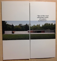
The images of the leaflet above are for the Mies Van de Rohe Barcelona Pavilion, this building is a real icon of modern architecture and the quality of materials and attention to details looking at space and composition of each room is an exquisite sight. The building design has a real focus on creating something stylish and simplistic and I feel this is reflected within the leaflet design. It is made of a much more expensive glossy paper stock and is much more rigid compared to the Joan Miro Foundation leaflet design. For me this idea of creating a leaflet for something that is already in itself a beautiful and inspiring design is defiantly a kind of graphics I know I would enjoy and engage with.
Within the field graphic design a area I have always been very interested and fascinated in is the branding, identity, guides and leaflet designs for galleries and exhibitions. These are just a few examples of some beautiful designs I have collected on my trip to Barcelona.
Fundacio Joan Miro- a beautiful modernist building looking over the city of Barcelona displaying some of great works of Joan Miro and other abstract and surrealist artists.
When creating exhibition leaflets I feel the design must reflect the art on show and the aesthetics and style of the gallery space and its content. There is a real opportunity for some much more artistic and expressive designs that have an focus on the being a reflection of modern and abstract art.


These images above show the program activities in the Joan Miro foundation from may to august of 2015. The design feels simplistic but has some brilliant details and very engaging yet informative choice of typography. The small graphic next to each page number for example is a simple way of creating a more personal design. The main logo for the 40 year anniversary reflects the building and the large curved air ducts seen on the roof of the gallery. The use of red for the subheading again adds this extra feeling of the leaflet being something precious and engaging.


The images of the leaflet above are for the Mies Van de Rohe Barcelona Pavilion, this building is a real icon of modern architecture and the quality of materials and attention to details looking at space and composition of each room is an exquisite sight. The building design has a real focus on creating something stylish and simplistic and I feel this is reflected within the leaflet design. It is made of a much more expensive glossy paper stock and is much more rigid compared to the Joan Miro Foundation leaflet design. For me this idea of creating a leaflet for something that is already in itself a beautiful and inspiring design is defiantly a kind of graphics I know I would enjoy and engage with.
Subscribe to:
Comments (Atom)


