As a part of PPP there was a call for submissions to brand and promote the upcoming week of talks. Myself, James Green and help from Ed Harland we created some initial designs and were chosen as the successful group to take this forward.
We sent over these initial concepts, using a simple structure that is unified with a singular recognisable typeface (Avant Garde).
Through feedback we developed some more refined designs and began to create a distinct brand that could be used throughout. We aimed to highlight the real diversity of the speakers being from different backgrounds, and working in really different places.
These further refinements were made and the whole branding began to look much more cohesive, additionally some moving gif's were created ideal for social media use.
Something really useful in this project was working to a tight deadline and ensuring a high level of quality. This meant a large number of amendments needed to be made to ensure every image was cohesive and reflected the quality of the week as best as possible.
Day 1 - Dines The video above is our own round up of the first day, showing how useful it was, how interesting the talk from Dines was and a showing some of the best work displayed from that day. As we were all asked to pitch individually to Dines and he would give us feedback on how to improve the project, this was all featured on the video for the Intern Instagram.
Day 2 - Rose Nordin - As this session we created a zine piece as a class, it was important to displayed this as best possible. The video about shows a gif of the zine.
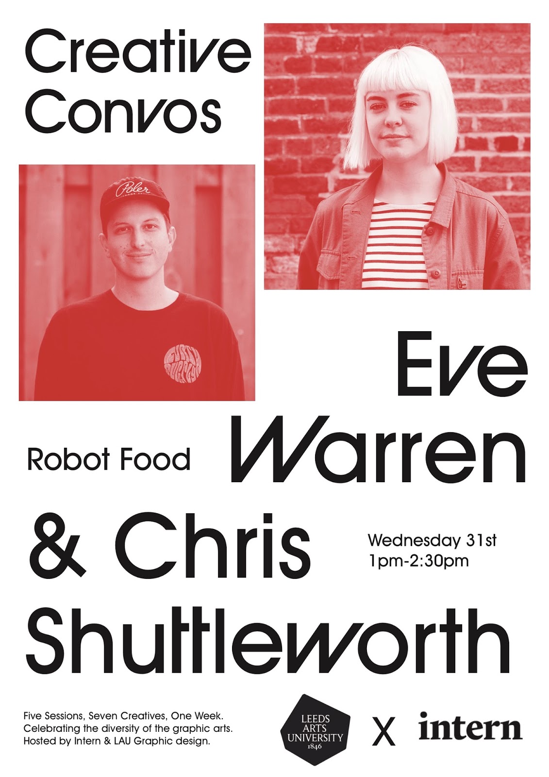
Day 3 - Robot Food, As this talk was more straight forward the video needed to reflect this, so more simple imagery was used, explaining the talk and making it as interesting as possible.
Day 4 - The Elephant room - As this was more of a general discussion this needed to be reflected in the video content. Leaving most of the content for the comment under the video for that.
Day 5 - Abraham Asefaw - This was mainly about how we create ideas so the whole video was based around the post it notes and the idea of a quick process of idea generation.
The final video was more of a round up of the whole week including our poster we created. Overall the video content came out really well.

As highlighted in the brief it would be a great opportunity to create some posters for the creatives to take away. These three posters I designed and printed out A1 for creative professionals to take home and possibly post is they wanted. I gave these to Dines, Chris Shuttleworth & Abraham Asefaw. All talkers I really admire and may contact in the future for possible internships or just a convocations.
Overall this project has been so useful in gaining experience, working on a live brief with a tight deadline, getting my own work out there. Working on things that I usually wouldn't and working for a real client. I feel it has been very well received and everyone liked what we have done for the branding and promotion and hopefully I will be able to contact some of these professionals in the future.


