Thursday, October 29, 2015

Time keeping

Time to daydream.
clears the mind for the creative thought process


no planning = no professional practice.


How is time planning possible?


1- Love Lists
Have to do’s
   Want to do’s……. dreams and goals


2- Knowing yourself
  Think about what takes you a long time? and what are your strengths?


3- Plan Ahead
Importance of network and seeing people.
The time is now….. don’t miss out!

We have been given the task to create a time table of everything we do in a week starting with things that were very important (Collage work/ Working at home). Then secondly things we do in our day to day life.


The Gallery at Munro House is an independent exhibition showcasing some of the best in the industry in photography, illustration and graphics. I have decided I want to visit this gallery to see what variety of work they have on display at the moment. I am also very interested in the Joan Cornella exhibition on at the moment these fantastic illustrations are very comical yet deal with real and ever present issues. I think looking at illustration is very important as it stands in tangent with graphic design.

Joan Cornella is a spanish illustrator and artist that is famous for his dark humour and surrealist illustrations based in Barcelona spain. I think this is a great exhibition to sample other areas of the creative industry.


Monday, October 19, 2015

NEWRAFAEL

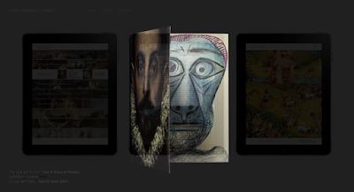
Rafael Rozendaal is a Dutch Brazilian visual artist that mainly creates online installations, websites and lenticulars. I have watched as many lectures and online interviews with the artist to get a feel for how he works and what makes him unique as an artist. 
http://www.newrafael.com/


He talks firstly about the internet and how it is such a accessible resource for everyone across the world. And discussed that fact that their can be photographs of art on the internet but it is rare to have art itself in its original form. He began to talk about the work online he had been creating and how for him it was important to be in the public domain and access to everyone.


This piece is about infinite growth and the idea of the global economy seems to always be on the rise. I think the artist is extremely good at getting a the meaning across of the artwork in a simplistic way. This is shown with these dollars building up and up continuously. 
With this next piece of the two people kissing he speaks of the fact the work has been sold yet it is still online for everyone to see, I really love this idea of creating work for everyone that is really accessible for
everyone on all platforms.
This next website is a add on for web browsing that removes all text from a website just leaving the images and layout. So it is a really different kinda of work to the other websites, the idea is really simple yet as there are so many different websites that the work really changes from site to site and there is a massive range of outcomes with this web tool. There is another similar browser tool the artist has created that transforms the different shapes of a webpage in to flat abstract colours again this is a very interesting piece of work as there is so many variations of outcomes and anyone can uses these tools to 
create art. This next website called Deepsadness.com uses abstract random shapes in different colours and when you click on the shape it changes to a different shape and colour and creates a random tone of sound taken from 12 similar tones. This piece I think is very interesting such a simple idea that has only a few aspects to it can work effectively and really have an impact on the viewer. This is a key aspect to Rafael Rozendaal's work that really makes it unique he creates interesting and informed piece's of work using such simple ideas.

This piece is a lenticular piece of art that changes colour as you move around it this is a totally unique piece of work and that I feel is really an amazing thing. This idea of merging the flat image and the moving image is something very different and something I have never seen before. I feel looking into Rafael Rozendaal's work has opened my eyes to a different style of design working using the internet to your advantage and creating simplistic and informed designs.


This is the largest screen in Korea showing an example of Rafael Rozendaal's artwork on a massive scale.

Friday, October 16, 2015

Artistic Inspiration


 I have picked out some of my favourite blogs, photographers visual artists and designers and some resources I had not heard about before to created this blog post to speak about why I like them how they influence me and what kind of works they do.
I think looking closely at website design can be very beneficial as in any creative industry how you present yourself is very important.


Booooooom.com is a blog that shows the latest in art design, graphics, illustration and photography it is a fantastic insight into current work and whats going on in the creative world now. There website is extremely clear and is order in such a way that everything is reachable and helpful. I mainly look at the photography and design parts of Booooooom.com on a weekly basis the work has no particular theme so it is good to grasp a range of different mediums.


 Behance

Behance is a way to see different artists and designers work quickly from around the world. You can upload your work if you are a adobe customer and this will get a much wider audience to view your work from around the world.


 Fernando Gutierrez is a London born graphic designer that works mainly in Barcelona and Madrid. I am a huge fan of his work and his design practice really influences me a lot. He works for a lot museums and galleries creating posters, booklets, signage and apps. I am very envious of his job and getting to work with beautiful existing art works from around the world. 
His design approach is fairly simplistic and uses typography to amazing effect. I love these book covers the colours have been chosen perfectly and they work excellently in a series.


This issue of Colours magazine designed by Fernando Gutierrez uses only images and no typography they magazine has been composed to tell a story with only images. This is a extremely interesting whether it is possible to portray a story just with images. Colours magazine is a very cool and insightful culture magazine.


MATADOR MAGAZINE
an International art magazine for a extremely up high end audience. The magazine is huge in scale and very thick the design is powerful and to the point. I think the name Matador is very iconic and stands out. I love the black and white high contrast photos they contrast well with the red banner.
I was lucky enough to see a Fernando Gutierrez talk part of EDO (editorial design organisation) it was very interesting to get the point of view from a practicing graphic designer, he spoke of the troubles of speaking with clients and coming to a overall agreement in the work.
Jonas Romo is a mexican born photographer that has a very distinctive photographic style using minimal architectural content to create very beautiful and detailed photographs. I think that his books are one of my favourite aspects of his work the layouts are simple and clean and really put all the emphasis onto the photographs. He also has an Instagram account that showcases all of his best work and this is where I found his work.
Rafeal Ronzendaal

Rafeal Ronzendall is a visual artist that specialises in abstract video art. I love his attention to detail and his way of working. He is a real expert on colour theory and picks his colours brilliantly. He has a great instagram showing a large range of his different workings.


MagCulture is an blog that celebrates editorial design
they have alot of events were the top designers in the magazine business talk about their careers and how they work and some of the problems they face. It is good to look at editorial design as sometimes there is too much of a focus on web content and the internet.


Thursday, October 8, 2015

Today in groups we were asked to make a short presentation for a given design studio ours being 'AH HA Studio'. All of the different studios were spread across the Globe from New York to Australia. Additionally all of the studios were very small in size and worked closely with there clients to create extremely personal and high quality designs. In our presentation we were asked to awnser questions on what they do?, where are they based?, who their clients are? and what is there unique selling point?

AH HA Studio
For our presentation we all looked over there website and into their various projects and design styles. Below is our slides for the presentation.


Ah Ha Studio is a Lisbon founded design agency set up by Carolina Cantante and  Catarina Carreiras formed in 2011. There work is very editorial based and there is a real focus on using beautiful paper. There unique selling point is fact that the company was set up by two women which is fairly rare in the creative industry. There is a very large range of different mediums

 used throughout there different projects from interior designs, posters and leaflets.


Hey studios 
http://heystudio.es/
Hey Studio is a small studio from Barcelona Spain founded in 2007 specialising brand identity, editorial design and illustration. There designs are extremely punchy and minimal with flat bright colours.
They have had many top clients such as Coca Cola, Braun and MetroArea New York.


T shirt Books Posters
Brand identity editorial design and geometric
Apple, Vodafone, Three, Turkish Airlines, General Electric, Jeremy Maxwell Wintrebert, The Wall Street Journal, Mr. Porter, CBS, Film Commission Chile, Inditex, Fortune Magazine, Design Studio, Monocle, MACBA, CCCB, Penguin Random House and Oxfam. Colour is a huge influence in their work bright bold colour.
Small means better relationship with clients and gets to know them better.


Sagameister & Walshhttp://www.sagmeisterwalsh.com/ 
A New York Based studio four person operation mainly specialising in Art direction, 2d design, Branding and Editorial Design. Collaborating closely with photographers filmmakers and other designers. The design styling is very bright playful colours and really have a different feel to them.


Hey Days
http://heydays.no/
Norwegian design agency based in Oslo.
Has a very small team of just six people.
They really strive and challenge there designs and create their own identity Visual Design.
The design styling is muted and simple design very minimalist.


Lust
http://lust.nl/
Dutch design studio founded in 1996 The Hague Netherlands
The specialise in new media and architectural design. Blending the use of digital and tactile design methods to create powerful and detailed graphics there aspirations are to really push the boundaries of graphic design.


Studio Dumbar  
http://studiodumbar.com/work
The Hauge
Formed in 1977
The first international Design agency from the netherlands.
They have offices in South Korea and China and really create a extremely large range of brands. The work with a lot of Visual Branding and Online Branding and they really try and work with lots of non profit companies.

‘Our style is that we don't have a style’ Gert Dumbar


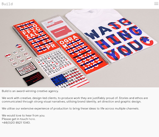
Build
Orginally based in London then moved to yorkshire
Clients inculde 
Made.com
Nike
The design museum
They specialise in branding and identity
advertising but mainly typography based
They have a very small group of only 4 designers.


Elmwood
http://www.elmwood.com/
Worlds most effective brand design agency
that have a really huge range of clients.
Have there own Tea and Beer Brand
Based London New york Singapore
One of the leading companies in the world for Branding and Packaging.


Bleed
http://www.bleed.no/
Formed and based in Oslo Norway and Vienna Austria
Won the european design leader award 2015
There is a real focus on strong identity unique ideas and
expressive design. They create some brilliant visual
identity based on architectural design


Face

Face is a Mexico Based company formed in 2006
The design styling is mainly modernist design and there is a very powerful use of colour and shape throughout the designs and they have a very different and new feel to there work.
There work deals with branding across the world and work closely with local cultural community's
Super Modernist design studio specialised in
developing honest branding projects across the world.


Dessein

A design studio based in Perth Australia.
They work with a large variety of signage design and branding. They use a lot of simplistic flat logos and designs. There motto is 'To effectively communicate with positive design outcomes which connect, engage and respond to target audiences.'


Wolff Olins
http://www.wolffolins.com/
Wally Olins & Micheal Wolff
There principles of there designs are to strive to making brands that last forever. They are a very world wide company based in London, San francisco and Dubai. They try to develop brand experience as much as possible. There clients including
Skype, EE and Aol.